
Tooltips
Published May 13, 2012
Tooltips
Presentation
Using the title attribute of HTML tags, it is possible to display a tooltip when the mouse hovers over the element.
Example
<span title="Here's a tooltip!">Hover over me!</span>
Hover over me!
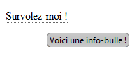
Nice, right? But, I don’t know what you guys think, but the tooltip is pretty ugly… At least, it is in old browsers:
Well, so what! With a little CSS we should be able to fix that, right?
Ah if only  … the problem is that this tooltip does not correspond to an HTML tag. It is managed by the browser and therefore it is not possible to modify its aspect.
But do not worry. There are plenty of ways to remedy this. Let me show you my way!
… the problem is that this tooltip does not correspond to an HTML tag. It is managed by the browser and therefore it is not possible to modify its aspect.
But do not worry. There are plenty of ways to remedy this. Let me show you my way!
Custom tooltips
The method that I am going to present to you here consists in writing and using JavaScript functions that will display the text that we see fit when we hover over an element. Next, we’ll use a bit of CSS to make our tooltip look a bit more presentable.
Make a bubble
To display a custom tooltip, there are 2 ways to do this:
- use an existing
divintended for this purpose; - create a new
divand add it to the page.
The first method consists of creating an area on the page that will be displayed when you hover over the right element. This can be done with CSS, playing with :hover states and, therefore, nothing really interesting.
Logically, I will therefore present the second method  .
.
To start, we’ll need to create a JavaScript tag:
var div = document.createElement('div');
div.id = 'tooltip';
div.style.visibility = "hidden";
document.body.appendChild(this.div);
We create the tag, we give it an identifier, we hide it and then we add it to the document. Then, you have to fill the tag with the content you want to display, then make it visible.
div.innerHTML = text;
div.style.visibility = "visible";
isVisible = true;
With a few refinements and putting it all in a function, we get this:
var isVisible = false;
var div = null;

function show(text) {
	if (isVisible == false) {
		if (div == null) {
			// add tooltips to body
			div = document.createElement('div');
			div.id = 'tooltip';
			div.style.visibility = "hidden";
			document.body.appendChild(div);
		}

		// Make tooltips visible and fill with the text
		div.innerHTML = text;
		div.style.visibility = "visible";
		isVisible = true;
	}
}
As a result, it is now necessary to make the tooltip disappear. For this, nothing too extraordinary:
function hide() {
	if (isVisible == true) {
		// Hide tooltips
		if (div != null) {
			div.style.visibility = "hidden";

			// Remove tooltips from body
			document.body.removeChild(div);
			div = null;
		}
		isVisible = false;
	}
}
We check that the tooltip is visible and that the tag exists, we hide it and then we remove it from the page.
Homing bubbles
Good. We know how to create our tooltip and destroy it, but we need to be able to position it in the right place. By the way, if the tooltip could follow the mouse, that could be nice. Well then, let’s go:
function move(e) {
	if (isVisible) {
		var div = document.getElementById('tooltip');
		if (navigator.appName != "Microsoft Internet Explorer") {
			div.style.left = e.pageX + 5 + "px";
			div.style.top = e.pageY + 10 + "px";
		} else {
			if (document.documentElement.clientWidth > 0) {
				div.style.left = 20 + e.x
						+ document.documentElement.scrollLeft + "px";
				div.style.top = 10 + e.y
						+ document.documentElement.scrollTop + "px";
			} else {
				div.style.left = 20 + e.x
						+ document.body.scrollLeft + "px";
				div.style.top = 10 + e.y
						+ document.body.scrollTop + "px";
			}
		}
	}
}
So here, it can be scary but you shouldn’t be afraid  The function just performs additional tests depending on the browser (the good old IE bothering us as always…).
So, simply, the function will position the tooltip a little below where the mouse is, based on the original coordinates of the event.
Finally, we tell our document to call the function when we move the mouse in the page:
The function just performs additional tests depending on the browser (the good old IE bothering us as always…).
So, simply, the function will position the tooltip a little below where the mouse is, based on the original coordinates of the event.
Finally, we tell our document to call the function when we move the mouse in the page:
document.onmousemove = move;
Bubble in style
Good, okay. We have our tooltip, but if you test it as it is, you will find that something is missing… the tooltip!
And yes. We didn’t define that the position of a tooltip had to be absolute to take top and left into account (if you look at the bottom of the page, you can see the tooltip appear), and we even set up the display! So it’s even uglier than with title …
Fortunately, the CSS is coming!
To prevent this, we add the class of the tag at creation time:
div.className = 'tooltips';
Then we define a corresponding CSS class:
.tooltips {
	max-width: 500px;
	overflow: hidden;
	position: absolute;
	border: 1px solid #C0C0C0;
	background: url('bg_tooltip.gif') 100% 100% repeat-x #FFFFFF;

	padding: 8px;
	font-family: Consolas, Arial, san-serif !important;
	font-size: 11px;
	color: #80808;
}
Of course, you are free to modify the appearance of your tooltip (I still recommend that you do not stray too far from the first part of the CSS). For the background, I use a simple image which is a gradient from white to a (very very) pale grey. You can easily reproduce it with CSS3:
.tooltips {
	background-image: -o-linear-gradient(top, rgb(255, 255, 255) 0%,
		rgb(240, 240, 240) 100% );
	background-image: -moz-linear-gradient(top, rgb(255, 255, 255) 0%,
		rgb(240, 240, 240) 100% );
	background-image: -webkit-linear-gradient(top, rgb(255, 255, 255) 0%,
		rgb(240, 240, 240) 100% );
	background-image: -ms-linear-gradient(top, rgb(255, 255, 255) 0%,
		rgb(240, 240, 240) 100% );
	background-image: -webkit-gradient(linear, left top, left bottom,
		color-stop(0, rgb(255, 255, 255) ),
		color-stop(1, rgb(240, 240, 240) ) );
	background-image: linear-gradient(top, rgb(255, 255, 255) 0%,
		rgb(240, 240, 240) 100% );
}
And to make it even more pleasant, we put rounded edges.
.tooltips {
	-webkit-border-radius: 6px;
	-moz-border-radius : 6px;
	border-radius : 6px;
}
Complete code
JavaScript
var isVisible = false;
var div = null;

function show(text) {
	if (isVisible == false) {
		if (div == null) {
			// add tooltips to body
			div = document.createElement('div');
			div.id = 'tooltip';
			div.className = 'tooltips';
			div.style.visibility = "hidden";
			document.body.appendChild(div);
		}

		// Make tooltips visible and fill with the text
		div.innerHTML = text;
		div.style.visibility = "visible";
		isVisible = true;
	}
}

function hide() {
	if (isVisible == true) {
		// Hide tooltips
		if (div != null) {
			div.style.visibility = "hidden";

			// Remove tooltips from body
			document.body.removeChild(div);
			div = null;
		}
		isVisible = false;
	}
}

function move(e) {
	if (isVisible) {
		var div = document.getElementById('tooltip');
		if (navigator.appName != "Microsoft Internet Explorer") {
			div.style.top = e.pageY + 10 + "px";
			div.style.left = e.pageX + 5 + "px";
		} else {
			if (document.documentElement.clientWidth > 0) {
				div.style.top = 10 + e.y
						+ document.documentElement.scrollTop + "px";
				div.style.left = 20 + e.x
						+ document.documentElement.scrollLeft + "px";
			} else {
				div.style.top = 10 + e.y
						+ document.body.scrollTop + "px";
				div.style.left = 20 + e.x
						+ document.body.scrollLeft + "px";
			}
		}
	}
}
document.onmousemove = move;
CSS
.tooltips {
	max-width: 500px;
	overflow: hidden;
	position: absolute;
	border: 1px solid #C0C0C0;
	background: url('bg\_tooltip.gif') 100% 100% repeat-x #FFFFFF;

	padding: 8px;
	font-family: Consolas, Arial, san-serif !important;
	font-size: 11px;
	color: #80808;
}
CSS3
.tooltips {
	-webkit-border-radius: 6px;
	-moz-border-radius : 6px;
	border-radius : 6px;

	background-image: -o-linear-gradient(top, rgb(255, 255, 255) 0%,
		rgb(240, 240, 240) 100% );
	background-image: -moz-linear-gradient(top, rgb(255, 255, 255) 0%,
		rgb(240, 240, 240) 100% );
	background-image: -webkit-linear-gradient(top, rgb(255, 255, 255) 0%,
		rgb(240, 240, 240) 100% );
	background-image: -ms-linear-gradient(top, rgb(255, 255, 255) 0%,
		rgb(240, 240, 240) 100% );
	background-image: -webkit-gradient(linear, left top, left bottom,
		color-stop(0, rgb(255, 255, 255) ),
		color-stop(1, rgb(240, 240, 240) ) );
	background-image: linear-gradient(top, rgb(255, 255, 255) 0%,
		rgb(240, 240, 240) 100% );
}
Result
<p><span title="This is a toolip !">Hover me !</span></p>

<p><span onmouseover="javascript: show('This is a pretty tooltip !');"
	onmouseout="javascript: hide();" class="info">Hover me !</span></p>
To go even further
Savoy tooltip
For even more comfort, it is common to see the tooltips appear with a fade. To do this, we use the jQuery library and its fadeIn() function:
$('tooltip').css({top: e.pageY+10,left: e.pageX+20}).fadeIn(350);
Even better ?
Suddenly, it’s a bit silly because we no longer use the title attribute and we have to define a class, the action when the mouse enters and when it leaves the element each time…
A classic improvement of this kind of system is to continue using title and to have a function that will parse the page and make the transition to the system presented so far.
With jQuery, this might look like this:
$('body [title]').each(function() {
	var $item = $(this);
	var $tooltip;

	// Make sure the item has a title
	if( $item.attr('title').length>0 ) {
		var title = this.title;

		// Empty the title
		this.title = '';

		// Actions to be taken when hovering
		$item.hover(function(e) {

			// Build the tooltip and append it to the body
			$tooltip = $('<div id="tooltip" class="tooltips"/>')
			.appendTo('body')
			.hide();

			// Append the content to the tooltip
			$tooltip.html(title);

			// Set the tooltip position and fade it in
			$tooltip.css({
				top: e.pageY+10,
				left: e.pageX+20
			})
			.fadeIn(350);
		}, function() {
			// Remove the tooltip
			$tooltip.remove();
		});

		// Bind a mouse move function
		$item.mousemove(function(e) {
			// Move the tooltip relative to the mouse
			$tooltip.css({
				top: e.pageY+10,
				left: e.pageX+20
			});
		});
	}
});
The jQuery demo is available here.
<p><span title="This is a great tooltip !">Hover me !</span></p>
About
This little tutorial was made based on my personal knowledge and my experience. I don’t pretend to show here THE solution but my approach to solve a given “problem”.
Code snippets are included and formatted in the page using Syntax Highlighter. It is an extension entirely written in JavaScript. Take a look or two
You may have noticed, but all the text tags I used that had a tooltip were underlined in dotted lines. It’s not the fact of the browser! This is a typographical “rule” frequently found on websites to indicate the presence of additional information.
abbr, acronym, span[title], strong[title], em[title], label[title], .info {
	border-bottom: 1px dotted #666; /* underline with dotted line */
	cursor: help; /* change mouse cursor */
}